With high-quality and high-tech products
Provide customers with the best service

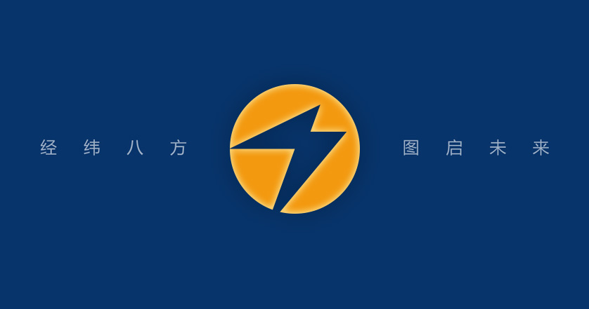
The logo is creatively designed by "wthd", the initial letter of "Weitu Hongda", and will“ ⚡” The super symbol of electricity is integrated into it, conveying the power industry attribute of the "Weitu Hongda" brand. The overall logo shape is trapezoidal and spreads upward, implying that the "Weitu Hongda" business is flourishing and growing, and Hongtu is developing; The Chinese logo shows the image of one party's seal, expressing the enterprise values of "Weitu Hongda" people, which are upright in their words and deeds, and upright in heart, mind, words, deeds and results.
The logo is mainly blue representing broadness and supplemented by warm orange representing harvest. Blue is the symbol of the sky and the sea; Orange is cheerful and lively, and is the warmest color. It means that the brand cause of "Weitu Hongda" is more magnificent and inherited from generation to generation.
With high-quality and high-tech products
Provide customers with the best service
Become a global leader in the field of new energy
Leading and respected brand
Inject energy into China's infrastructure
Right mind, right mind, right words, right actions
Positive fruit
 Official Wechat
 Official Weibo
E-mail: yy@wthdsy.com
Power Expert


